Editing and Proofreading Tips for Design Professionals: Make Every Pixel Read Perfectly
Chosen theme: Editing and Proofreading Tips for Design Professionals. Great design deserves equally precise words. Here you’ll find practical, designer-friendly habits, checklists, and stories that turn nearly finished work into confidently polished experiences. Subscribe for more editorial craft tailored to visual creators.
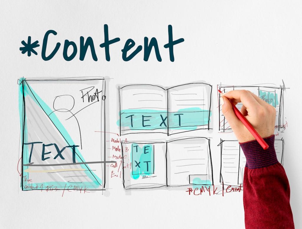
Adopt an Editor’s Mindset Without Losing Designer Flow
See Layout Like a Sentence
Think of hierarchy, spacing, and alignment as grammar for the eye. When the visual sentence flows, readers grasp intent faster and mistakes pop out sooner. Train yourself to read screens aloud; awkward rhythm often reveals typos and clumsy phrasing immediately.
Two-Pass Method That Reduces Rework
Make one quick structure pass for headlines, labels, and order, then a precision pass for punctuation, numerals, and brand terms. Fifteen focused minutes per pass usually save an hour of late revisions, especially when stakeholders spot fewer errors during review.
Set Timeboxed Proofreading Windows
Protect small editing windows at natural pauses: after wireframes solidify, before handoff, and right after staging deploys. Short, scheduled checks build momentum, keep context fresh, and help your team trust that words receive the same rigor as pixels.
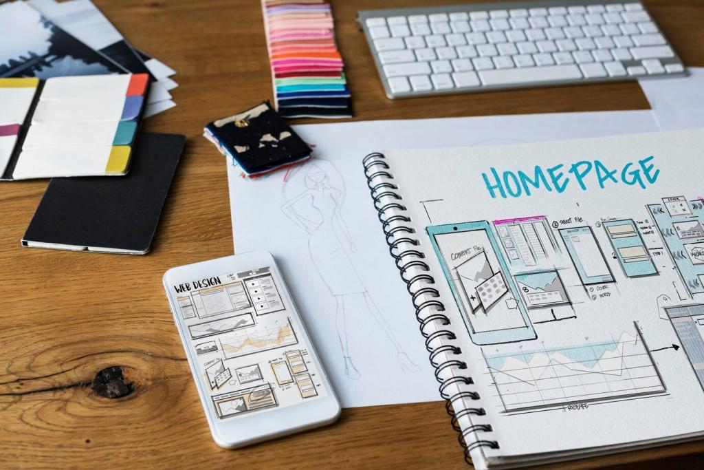
Build a Designer-Focused Proofreading Checklist
Verify product names, capitalization, and trademark symbols. Confirm numerals, currencies, and measurement units match regional standards. Standardize date formats and time zones. Little discrepancies confuse users, complicate support, and can even cause compliance headaches you never wanted.
Use dynamic spelling in layout tools like InDesign and Illustrator, and explore community spellcheck plugins for Figma or Sketch. Run checks on master components and shared libraries so repeating microcopy stays correct across dozens of screens automatically.
Tools That Catch What Your Eyes Miss
Pass key screens through Grammarly, Hemingway, or LanguageTool to catch grammar slips and dense sentences. Calibrate for your audience, not generic rules. Designers can balance clarity with brand personality while avoiding stiff jargon that increases cognitive load.
Microcopy That Guides Behavior
Action-Oriented, Testable Language
Use clear verbs and remove double negatives. One team saw a nine percent lift in conversions after replacing a vague “Submit” with “Create my account.” Invite readers to comment with their best before‑and‑after button upgrades and what changed user behavior.
Error Messages That Teach, Not Scold
Explain what went wrong and exactly how to fix it, in the same friendly voice as success states. When a checkout error cited an invalid postal code and suggested accepted formats, support tickets dropped noticeably within a week of launch.
Where Visual QA Meets Editorial QA
Align H1, H2, and body styles consistently. Avoid orphan and widow words that fracture scanning. Adjust line length and line height for comfortable reading. When type rhythm feels natural, editorial mistakes become easier to spot and correct quickly.
Where Visual QA Meets Editorial QA
Verify color contrast meets WCAG guidance, especially for body copy at 4.5:1. Be careful with ultra‑light weights and full uppercase, which slow reading. A quick legibility pass often reveals where microcopy needs bolder emphasis or simplified wording.
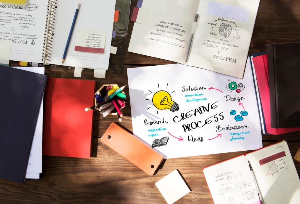
Collaboration Rituals That Make Words Better
Co‑create with a content designer or writer weekly. Review voice, terminology, and component copy in one place. A shared glossary prevents drift across squads and keeps proofreading from becoming a last‑minute scramble under deadline pressure.
German and Russian strings often expand, while Chinese may compress. Leave flexible space and avoid hard truncation. Use pseudo‑localization early to catch overflow. Check units, idioms, and cultural references so messages still land when localized.
Verify characters with diacritics render cleanly, and ensure right‑to‑left layouts mirror correctly. Watch hyphenation and line breaks. Non‑breaking spaces around currency and initials matter. Editorial diligence here prevents visual glitches that erode trust immediately.
Write concise, meaningful alt text and avoid repeating visible captions. Ensure ARIA labels match visible copy and the screen reader order follows the visual flow. Invite readers to share accessibility proofreading tips that helped their teams ship more inclusive design.
Ship With Confidence: Preflight and Post‑Launch Checks
Preflight Your Files Like a Pro
Run layout preflight for missing fonts, overset text, and broken links. Package assets, lock final styles, and version filenames clearly. A fifteen‑minute preflight prevents messy hotfixes and earns trust from engineering and stakeholders protecting the schedule.
Verify Live Content, Not Just Comps
Check production builds on real devices and browsers. Confirm links, legal text, and error states match the approved copy. Use link crawlers and screenshot diff tools to catch regressions. Share a quick launch-day checklist with your team for consistency.
Measure, Learn, and Iterate the Words
Monitor search queries, support tickets, and task completion for language confusion. When metrics spike around a phrase, rewrite and retest. Tell us your favorite microcopy win, and subscribe to get new editing frameworks tailored for design professionals.